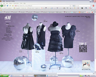
 http://www.hm.com
After selecting my country, the site opens up to a full-screen, photographic, Flash page advertising H&M’s latest collection. This surely keeps people returning season after season, looking for something artful and new. However, despite the entertaining, moving content, I cannot decipher where I should go. Intuition says try to buy a current product, so I look for a menu to begin shopping. There are two: main on the left and settings in the upper right.
The words in the main menu changes color keep it from blending into the changing photo backgrounds. Some pages are slightly unreadable, but this eases because the rollovers are red and animated. As you go deeper into the site, submenus drop down and indent, functioning like a breadcrumb. It never disappears, so you can always return to the home page. The corporate wording is easy to understand ("About H&M", "Investor Relations", etc.), but gallery displays are grouped under “Inspirations.” As to be expected, there is no correlation between Inspiration pages which see, partially like news and updates. While one displays the latest Winter Collection, another has the Top 5 of some product category, and another has a program for uploading your photo, so you can play dress-up on yourself.

Incorporating photography and video in websites creates a more immersing environment. Every page presents a different call to action, like the virtual runway which invites you to zoom in on garments. However, viewing such an image heavy site requires cable connection or faster, and there is no simpler, alternative portal. However, the designers did, however, take wide-screen monitors into consideration. Photo backgrounds keep to aspect ratio and lie atop another background image. Nevertheless, the menus cling to the sides of the screen, resulting in an open but horizontal page. The site avoids visual clutter by using pagination for galleries and selecting photos with positive and negative space that lend to natural grid structure. The unifying, header color is red, obviously chosen for the logo. This logo is a brush font, which contrasts nicely to the black or white, sans-serif, body text. Because font size stays the same, the change color change between pages is tolerable. Most pages have sound, but miraculously, it is linked to clicks, so it plays when the user expects.
I had difficulty finding shopping information. Although the galleries displayed prices, they did not allow purchase. To make it easier to access subsections, I checked the site map, but it was incredibly large and pertained overwhelmingly to corporate. The closest thing to an online store was a locator for real stores. This was when I realized that, despite the Flash displays, the true purpose of the site is to provide company information.

H&M has developed an engaging site, highly attractive to investors. However, ordinary customers may be confused due to the lack of online store component. The photographic galleries are visually appealing but difficult to navigate. There are occasions where one can be too creative, to the point of being unintelligible. H&M needs a more identifiable customer section to cater to shoppers. That said, the site has done more than most other by providing more than an information repository – providing fun.


No comments:
Post a Comment